UX Design in the Irish home
UX In the Irish home
When we think of UX we think of the digital and not physical, well most of the time. Yes, a Users experience can cross over to the digital realm or only exist in the digital space, but sometimes the experiences can be totally physical i.e. queuing for coffee or taking out a book from the library. One thing that I have been thinking about, is have we ever thought about UX in our homes? Many things that apply to UX in the digital realm apply in the physical. Some of these are user research, affordance, flow and context. I have wondered how this type of thinking would apply to places I have rented over the past 19 years in Ireland. You could change UX to RX (Renters experience) Over that period of time renting in Ireland, I have noticed some common traits in the design of houses, particularly those which I have rented. What I have noticed is that it tends to be the most frequently used areas that just don't quite hit the spot for a good living experience. As a family the most frequented areas are the kitchen and hallway and these are the areas that throw up the most problems.
I have not done any extensive research regarding this. It is solely based on my own experiences as a Renter. As a Designer, I'm questioning the design environments, how they flow and function. I felt that I would talk a little about the environment I experience day-to-day. I wondered if there was a better way of designing rented spaces.
Kitchen
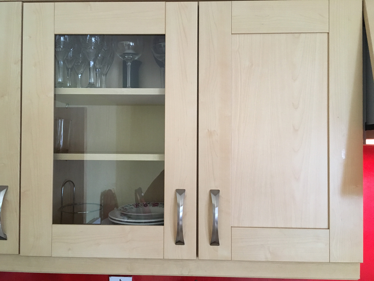
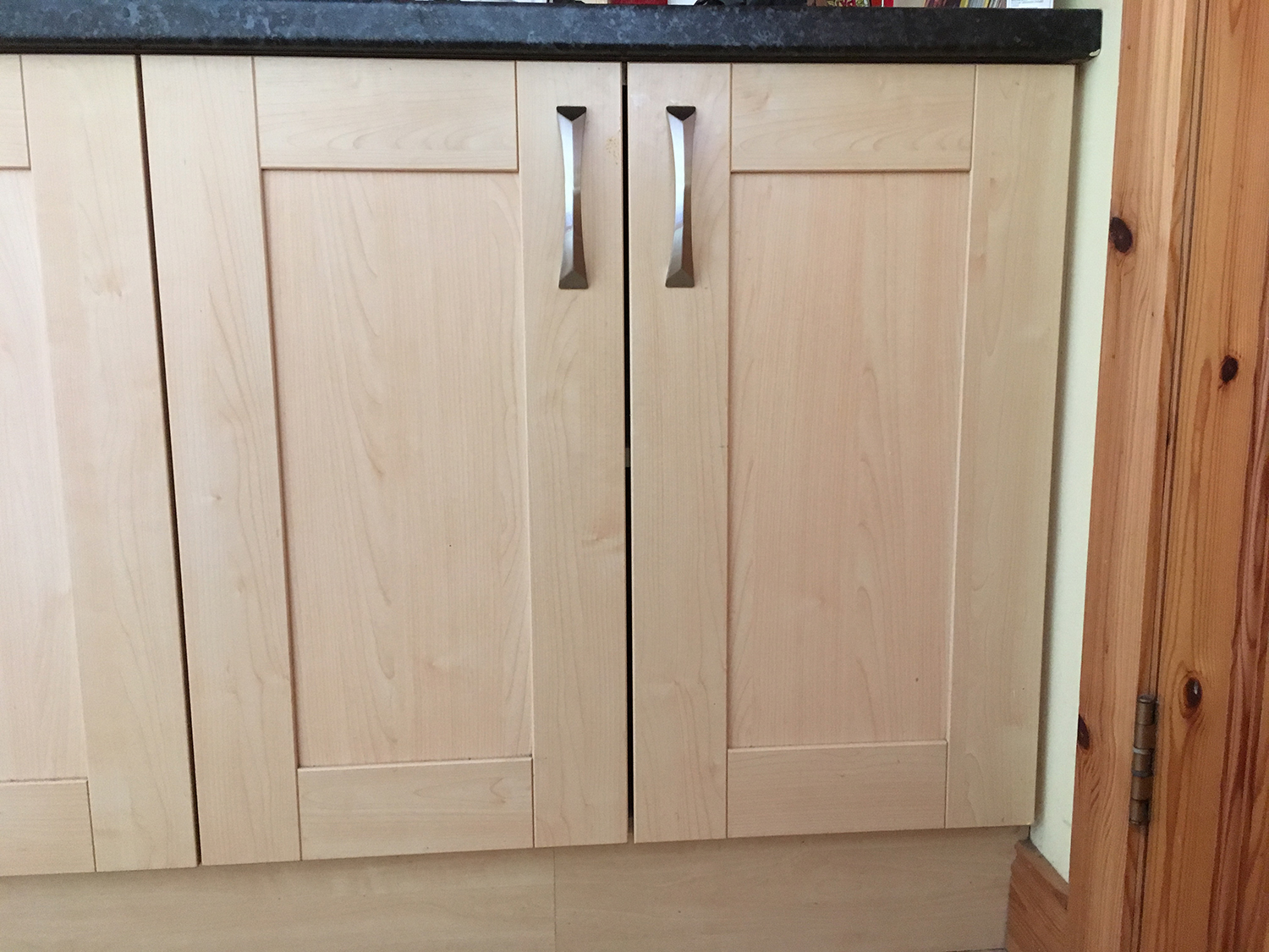
In our kitchen, there seem to be lots of space wasted particularly in the design of the kitchen units. This has been a common theme in all of the house that I have rented. I have highlighted here some of the areas where I feel space is wasted. I wonder if there a better solution to the design of the kitchen units or can the space be used in a smarter way. During the design process is the person designing the units taking into consideration how they will be used and the space they will occupy within the kitchen?
There is an ergonomic standard that kitchen units are based on.
The standards are based on a person that is 5' 3" inches to about 5' 8" inches. Now I'm 6' 1" and my partner is 5' 3" so in terms of usability we are a little bit under and a little bit over. The stuff that is out of reach for my partner is in reach for me. So we are kind of covered. A large proportion of our foods are stored in the lower cupboards. There is a constant bending down to access pots and pans and tins of food. This constant bending down would not be great for the body in the long term. I'm sure for any elderly person this could be a little bit harder.
Another observation I've noticed with the kitchen is the lack of thought for families that use the kitchen area. An example of this would be child locks on lower cupboard doors. Childproof catches and ties have to be bolted on to make the units inaccessible for young children. I wonder if there a way to factor these into the design of the kitchen units themselves. I mean there is a good chance that a family will be occupying a four bedroomed house such as the one we are currently in. Maybe there is another solution out there. Obviously, Contractors that are building the houses in the housing estates for renting would have to think about everything as a whole. The question that I'm asking is there a more flexible/adjustable option for these kitchens and others spaces inside and outside the house in terms of the building process and final built house? Please comment below if you know of one.
Hallway
The area with the most traffic in the house is the hallway. We come in from the outside and walk through to the kitchen or sitting room bringing with us everything that has stuck to our feet when walking outside. Now if you have a young child under 3 years of age you will most likely have a buggy for them. If you unknowns to yourself drive over dog excrement on your travels then this can be a quite a disgusting thing to take into the hallway of your home. With no transition area, the hallway is the only option. When you get the chance to clean the wheel its not only the wheel that you clean but the floor also. Quite frustrating for parents
The hallway is the transition area taking you from the inside to the outside and visa versa. When you open the front door you are straight out in the elements.
This area can be hard to keep clean and free from clutter. For anybody that has kids, you know that this can be quite hard at times. It is the area where shoes and jackets are kept. When you have 3 to 4 people in the house this area can get a little crowded. Ideally, there would be some sort of transition area before you enter through the front door a type of porch area.
If you have the door open dust and dirt blow in. When you have an 11-month-old baby that is crawling and picking things up this 3 to 4 times daily sweeping of the floor can be a little tiring. A porch area would give that chance to shut the outer door and then open the inner door and stop dirt from blowing in. When the houses were designed I feel something like a porch/transition area would have worked great.
Another frustration is if the back door leading to the garden is open as well as the front door this creates a draft causing the front door to slam shut. Getting heavier doors would obviously elevate this but I'm thinking more about the construction of the house from the start. There should be a standard weight on the doors like there is with the standard height of the kitchen units.
Exterior
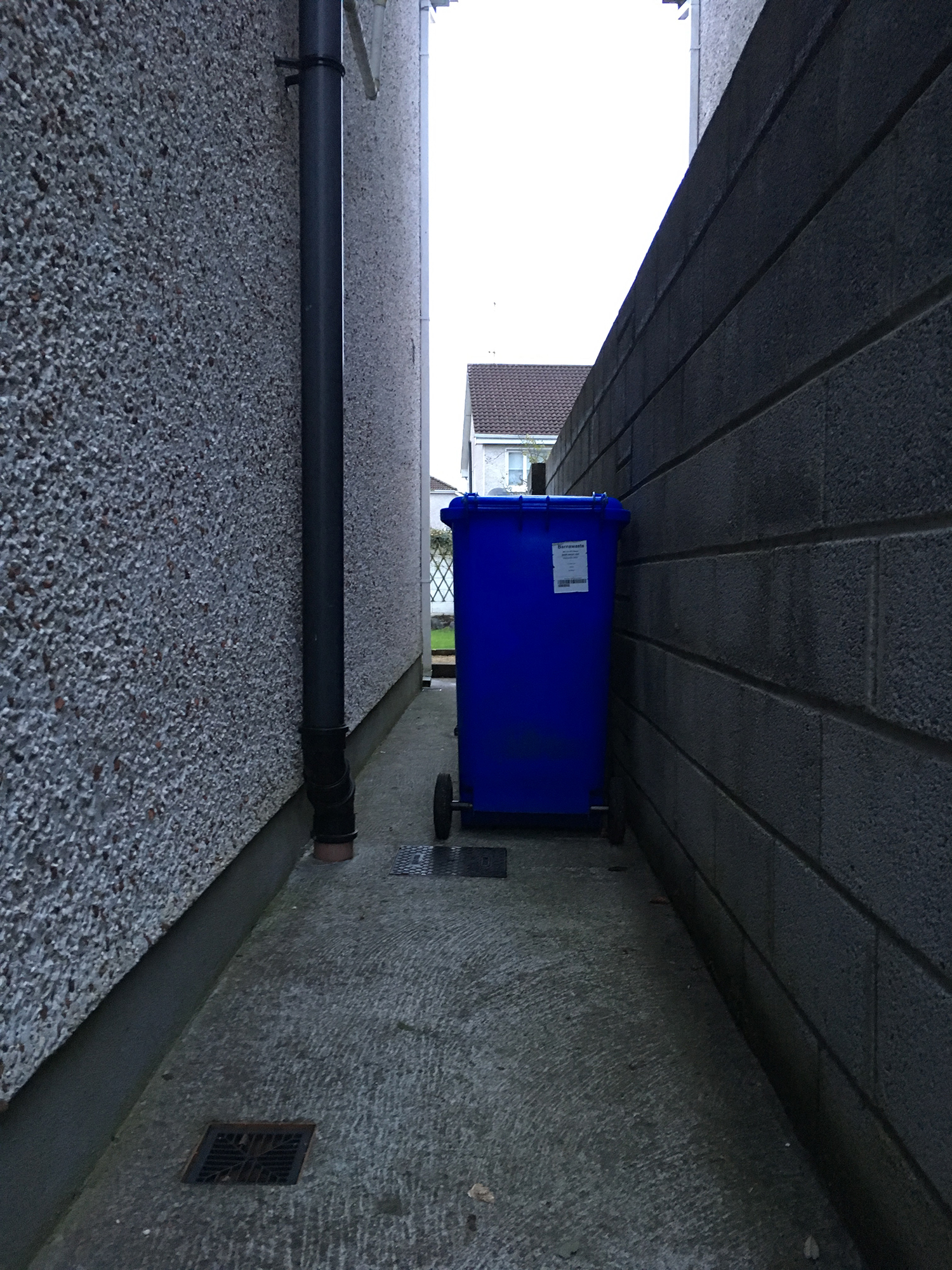
Like many of these semi-detached houses, the side of the house can be narrow in size. As you can see from the images there is very little room to move when the bins are in the lane.
Another two foot wider would be ideal.
If your 11-year-old has his friends over and you want to be able to keep the front door closed so they don't run in with their muddy shoes. You have to keep the side gate open. Having to move the bins all the time can be a little tiring though.
When building a house or houses there are many elements that need to be taken into consideration, that contribute to the overall running of the house once the family is in. Yes, you can get the bins in various sizes but for something like a recycling bin, you need to have a large size. This is due to the amount of plastic packaging that food comes in.
It would be interesting to know how they calculate the width of the side entrance of a house. Also, do they take into consideration when designing the house what will actually go into the side entrance or how families will interact with the space once inside?
Conclusion
Overall the house we live in is good in-terms of heating and size. It is definitely the best-rented house I have lived in. There are just a few things that could be better from experience point of view. Generally, houses in housing estates are built the same if all built by the same Contractor. What I would like to see is a more user-centred approach to the construction. One of the key elements to Design Thinking is rapid prototyping. I'm sure it would be possible to erect a dummy prototype of a house just to get a sense of size. You could get feedback from families about the flow and usability of the house.
The only way to get exactly what you want in terms of living space is to build it yourself. It would just be nice to see in the rental market a more user-centred approach to construction.


