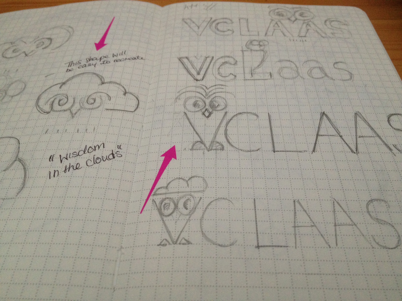

VCLASS Logo mark
Problem:
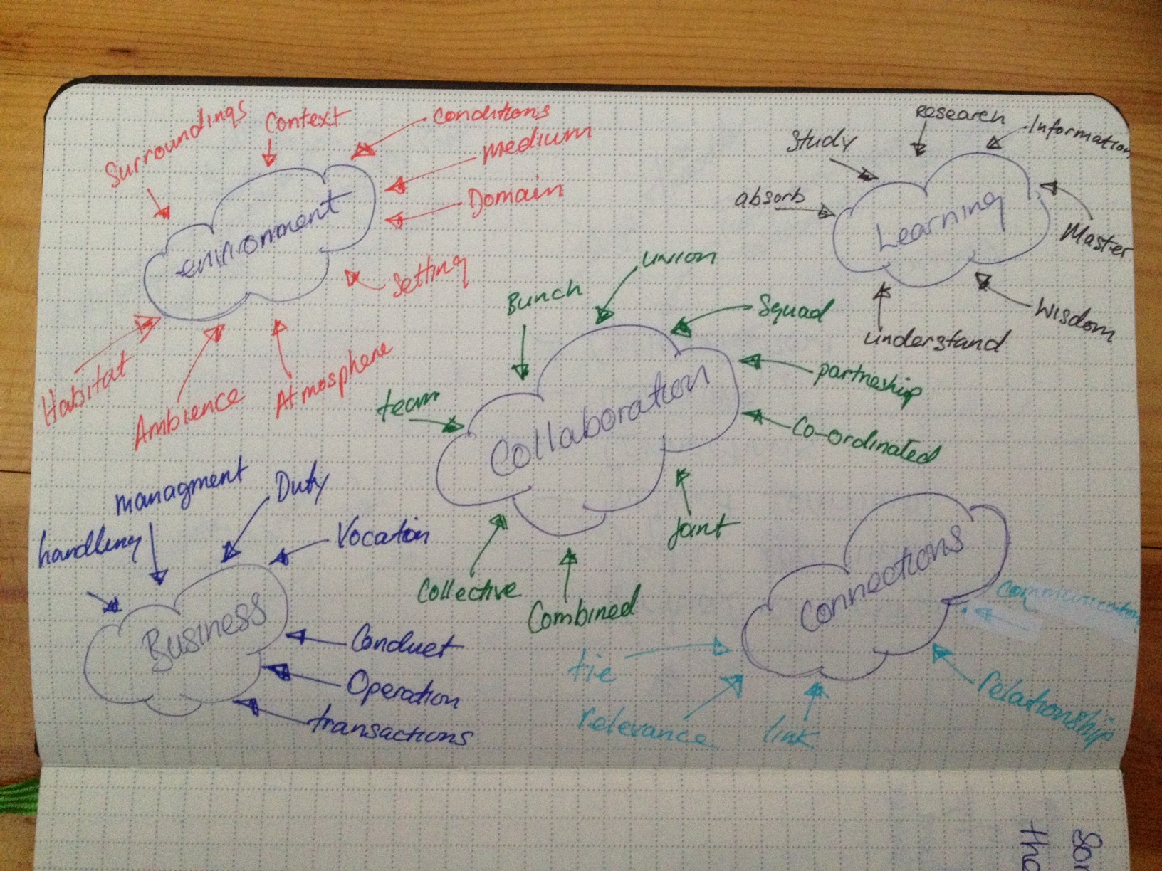
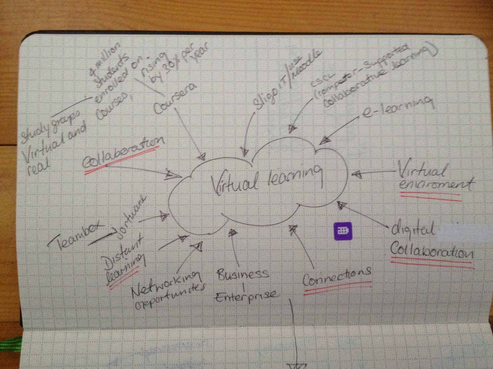
For this project I was commissioned to design a logo for a start-up company that specialise in virtual learning. The virtual learning is provided to businesses and learning institutions. The project aim was to provide an effective logo for the Vclaas company that is unique and adaptable for the future growth of the brans. After some extensive research and concept development an appropriate solution was formulated.
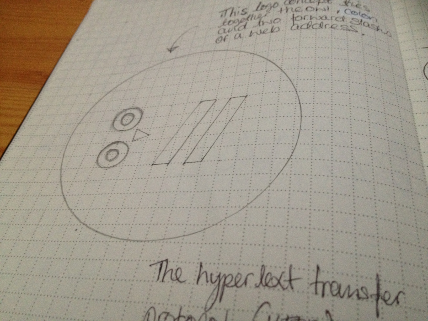
Solution:
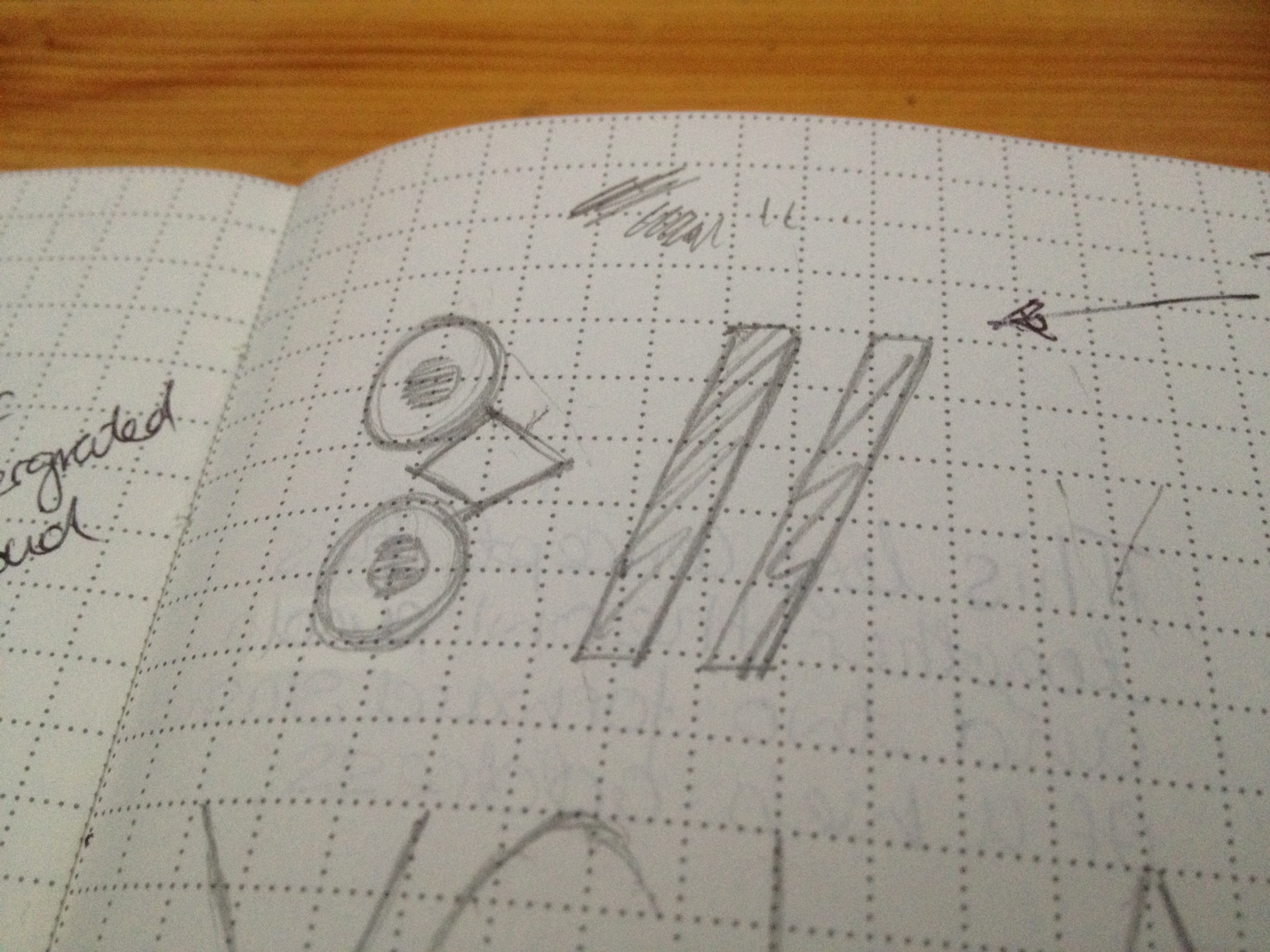
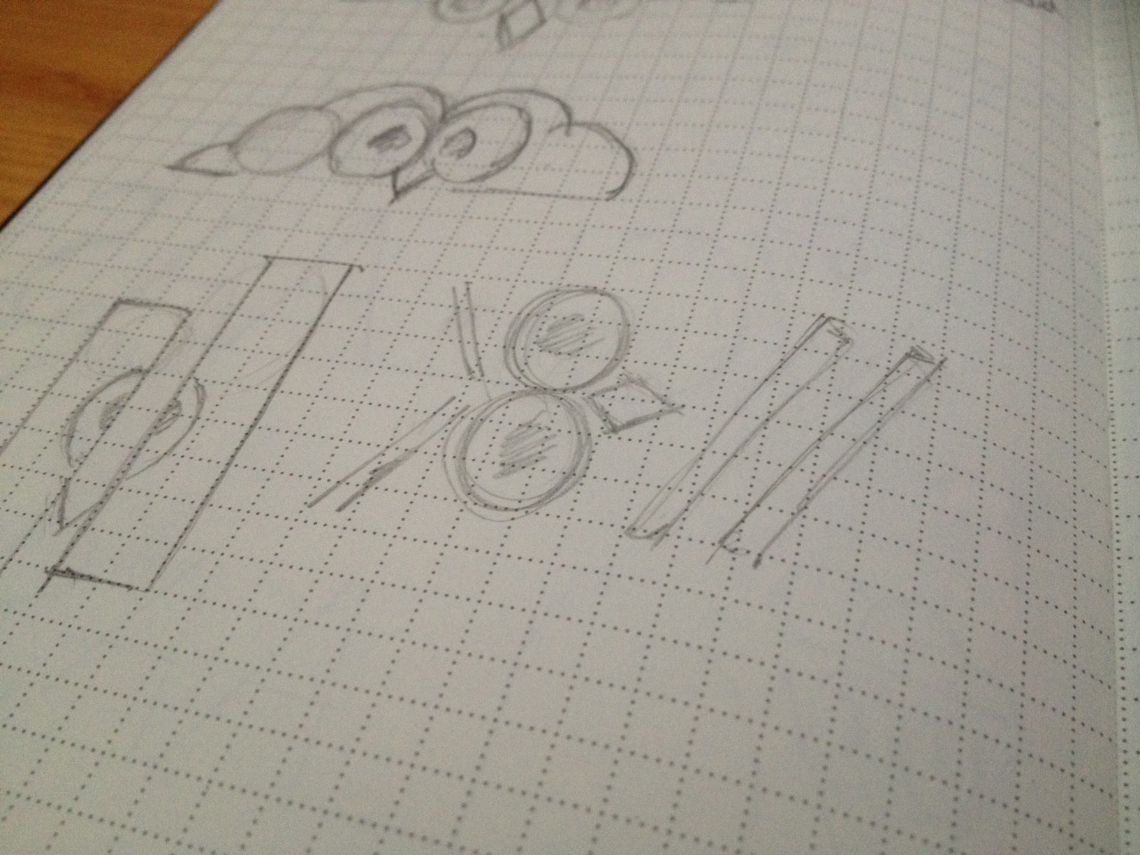
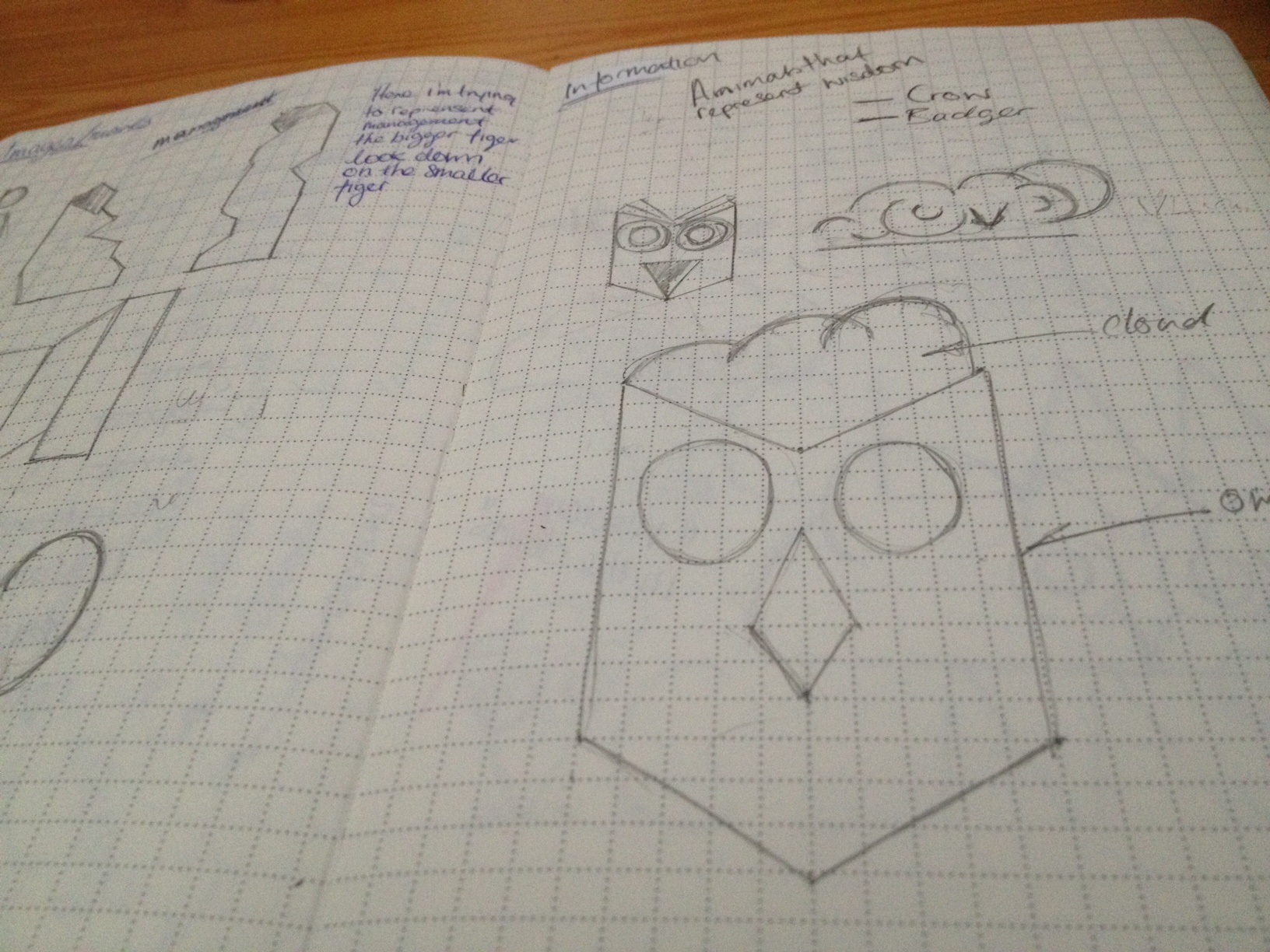
The solution combines the colon and forward slashes of a website URL, an owl, and the earth. The owl represents wisdom, which ties in with one of the core values of the company. The URL elements when combined with the key features of the owl, (the eyes) creates a unique mark. These are all housed in a circle to represent the World Wide Web. Back to Portfolio page