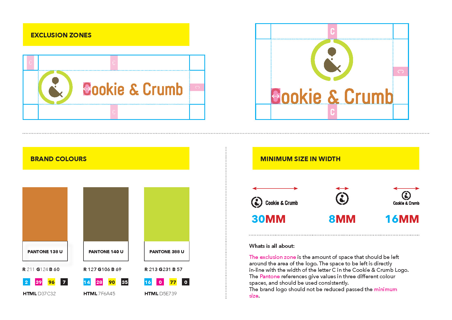
Cookie & Crumb Logo Mark
Problem:
Cookie & Crumb are a limerick based food business that provides cookie mix ingredients in a jar. The cookie mix comes in a range of sizes, flavours and seasonal themes. The food business was looking for a design company to design a unique logo mark that would encapsulate their brand's identity.
Research:
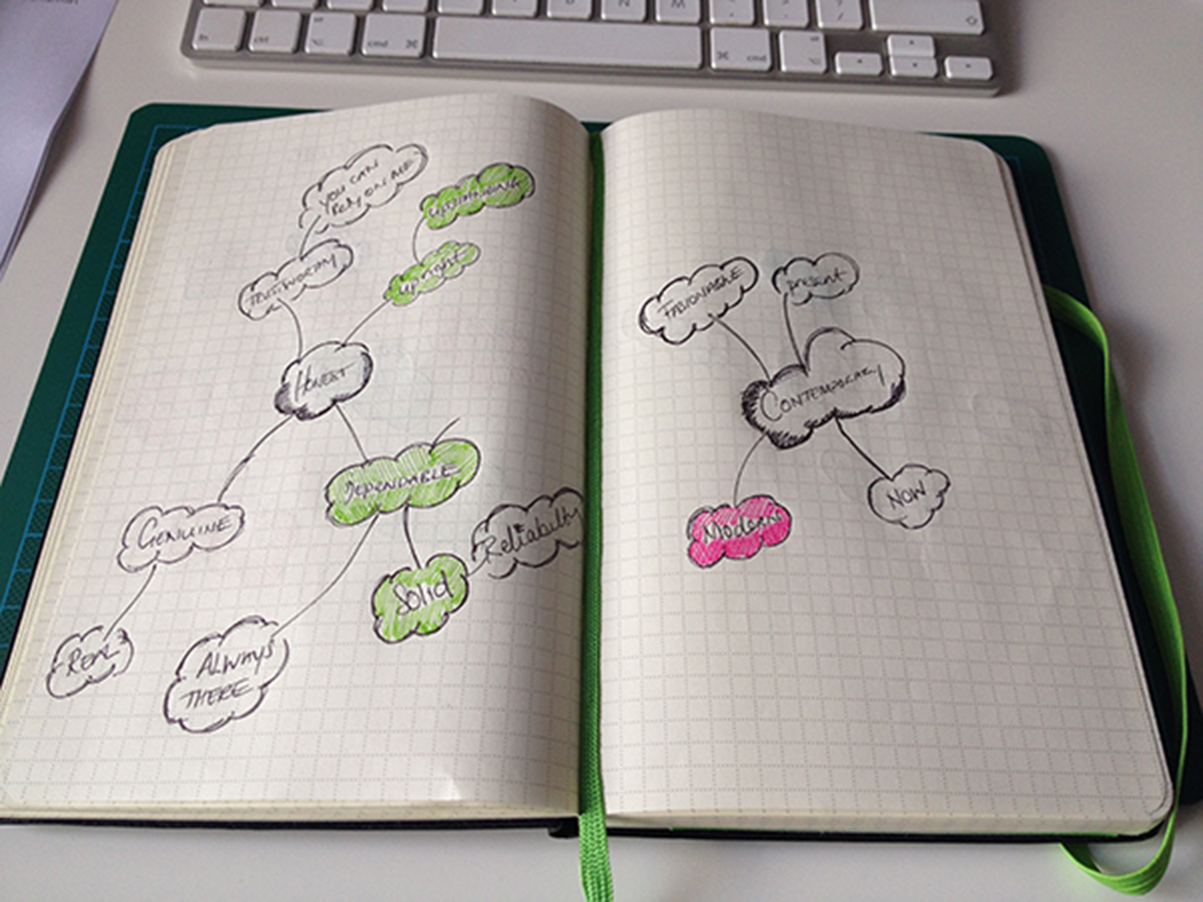
As with all logo design projects the research, phase started with an extensive review of other brands in the cookie mix space, and how they presented themselves. The research focused on the visual presence of the competitors both online and offline, looking for good examples of design consistency. After the research phase, a number of mind maps were created to establish what the brand personality was of
Cookie & Crumb and what emotion needed to be conveyed.
Solution:
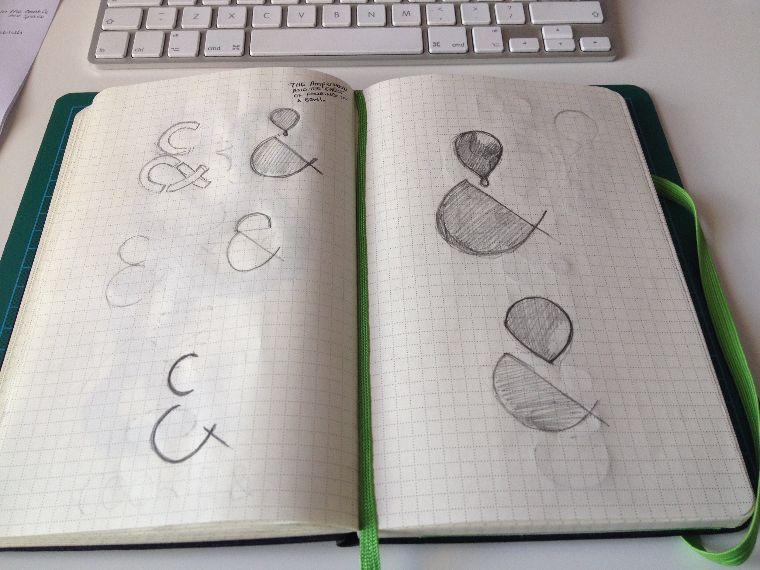
After the research phase, and the mind maps, the next phase was the creation of mood boards. These mood boards would create a visual reference for the logo project. The final mood board conveyed a sense of indulgence and fun. One of the images on the final mood board was the pouring of chocolate into a bowl.
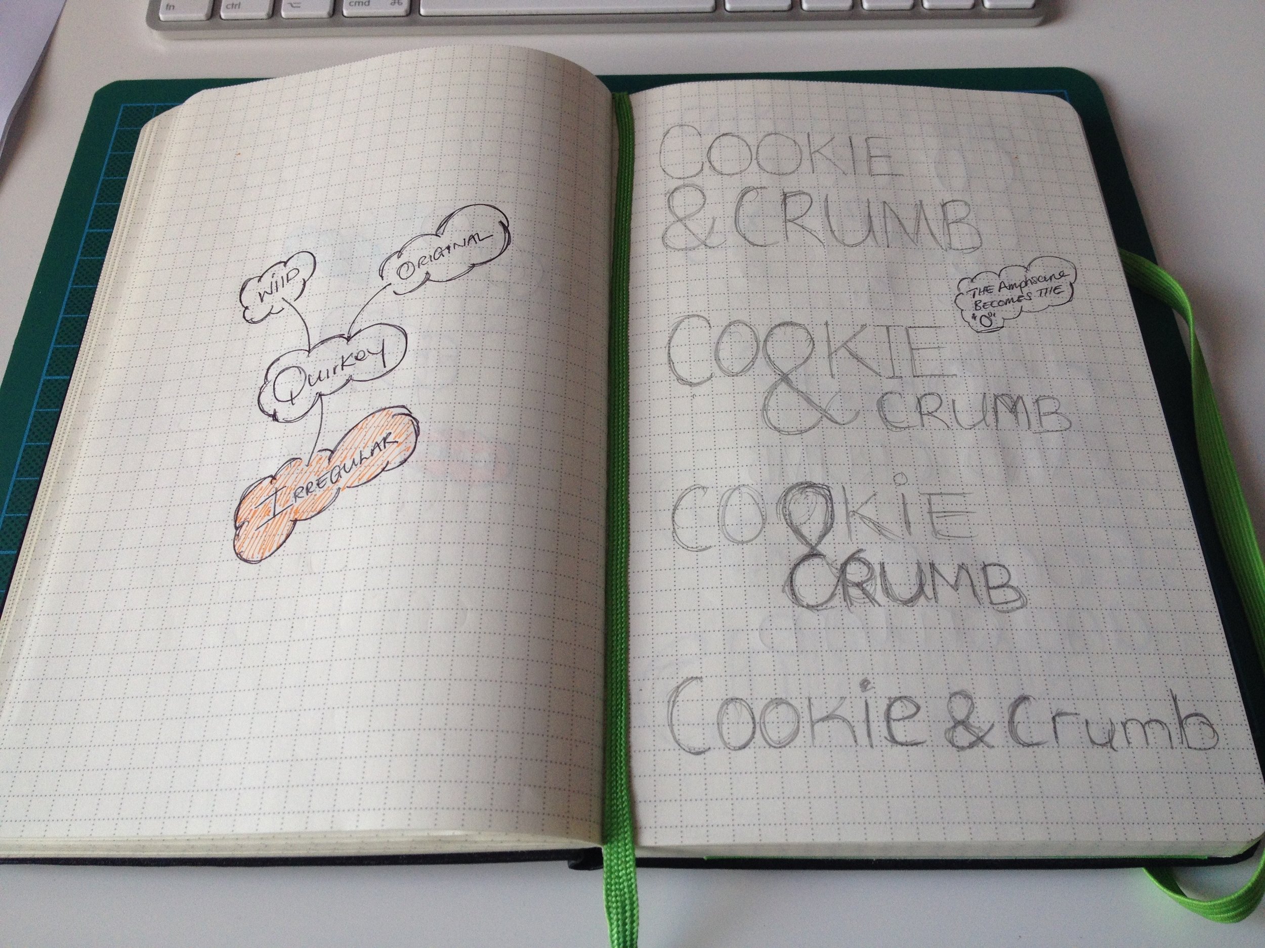
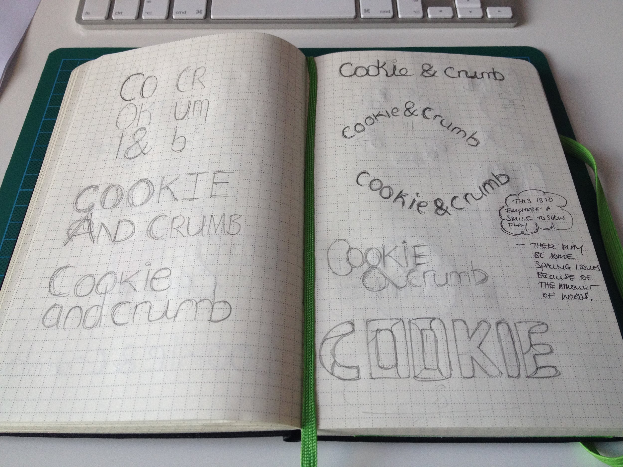
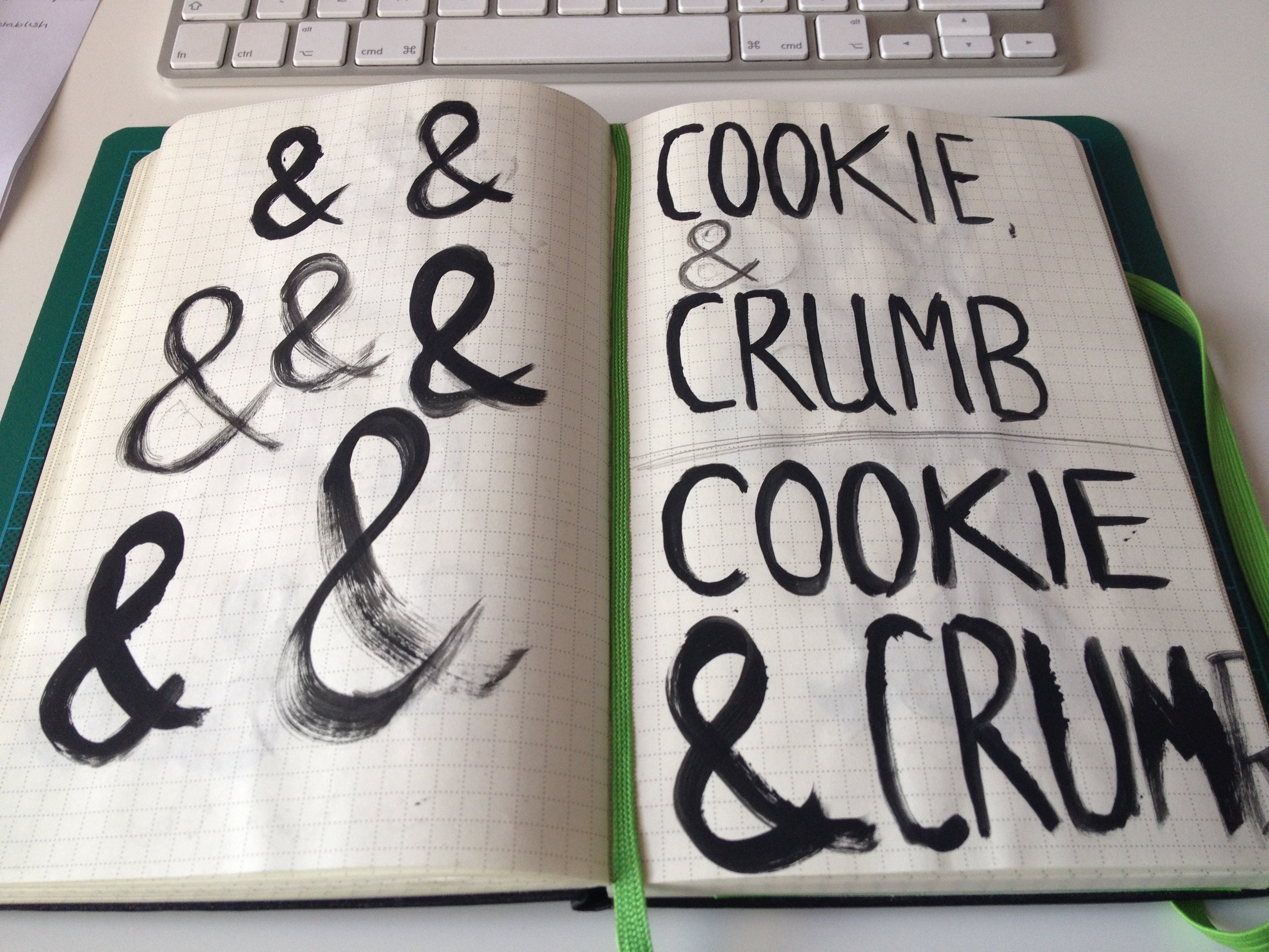
This image was seen as a good example of indulgence, and a possible starting point of the ampersand for the logo mark. The final mark represents both an ampersand and chocolate indulgence. The mark is then housed inside two c's that represent Cookie & Crumb. The logo is then matched with the Melbourne typeface, adding to the overall look and feel that was envisioned. Back to Portfolio page


